(See the prelude for some general information about what this is all about)

Fig. 1: If you plot the program’s runtime versus CPU count at strong scaling, nobody will be able to tell whether scalability is good or bad at the larger CPU counts.
Apart from using a logarithmic scale (see Stunt 3), deficiencies in scalability can also be hidden effectively by plotting absolute runtime. This works for strong scaling only, since weak scaling shows constant or increasing runtime when the number of CPUs goes up.
Of course you should start at a very low number of CPUs (and not use log scale this time, or you’ll be caught immediately). Then, runtimes at large CPU counts will be compressed to a small ordinate range, and nobody will be able to tell the difference between a 1.5 or a 2.0 speedup — just as you need it (see Fig. 1). The casual observer is always stunned by the strong decrease in runtime, without noticing its insignificance. Even if the curve starts turning upward at some critical CPU count, you can often get away with the statement that your code scales up to this point, even though parallel efficiency has gone down the drain much sooner.
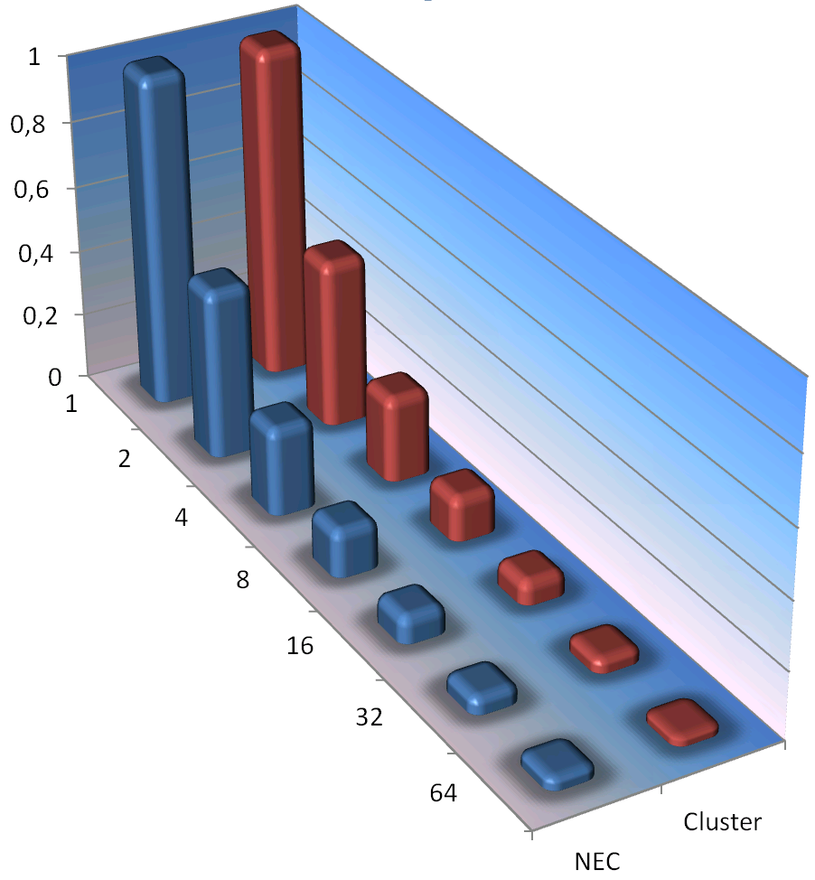
Fig. 2: A little 3D and texture sugar will hide unpleasant truths even better. And yes, the numbers are very different at large CPU counts!
To make the results even more striking you can use the CPU time per core instead of overall wallclock time. Depending on how you determine CPU time, overhead like OS calls (system time) may be omitted and you get better-looking results. Not that it would matter in any way, because it’s all swamped by the scale.
A very popular variant of runtime graphs is the “obfuscation by eye candy fury”. Excel makes it so easy to add visual sugar to your graphs; you can literally click your audience into oblivion: 3D beveled columns, drop shadows, fill gradients on walls (and columns!), fancy textures, etc. etc. A large number of data sets will also help (but see Stunt 11 for the full potential). Combined with the runtime-vs-CPU-count trick from above, comparing different systems without revealing the truth is a solved problem (see Fig. 2). Don’t forget to choose colors that will be indistinguishable in a grayscale printout; readers can’t criticize what they can’t see…
I don’t see why it’s wrong to plot total wall clock time divided with number of processors, versus number of processors. If the total t/N keeps decreasing, that’s a good thing!
Yes, but “keep decreasing” is not enough. A scalability graph should show by _how much_ runtime decreases when you, say, double the number of workers. If you plot it in the way shown in Fig. 1, this information is hidden by the linear scale on the y axis. It’s extremely hard to tell how well the code scales from 32 to 64 CPUs.
Furthermore, if you – as you suggested – plot t/N instead of just t, the value keeps decreasing even if the total runtime grows (slower than linear) with N. There is no valuable information to be gathered from such a plot.
What about plotting N*t against N? (with N number of workers, and t parallel wall clock time). For a linear strong scalable algorithm it should be constant … Besides, if it increases, e.g., by a factor of 2 when doubling N, it tells you efficiency has drop by a factor of 2 …
Yes, plotting N*t is sometimes useful; it is like a “cost function”, telling you how much resources (CPU-seconds) you have to spend solving the same problem with different N.
These posts are so on spot. Thanks for putting them up.
I found some papers using cpu cycles per output element, what is your opinion on this kind of measurement.
Thanks again for these very insightful articles
CPU cycles per iteration may be relevant; it depends on what you do with this data. If you have a low-level performance model predicting cycles per iteration, and you plot the measured cycles to show agreement (or disagreement) so that it helps you understand your code better – why not?